I love mountains. I was surrounded by them in Los Angeles, on the San Francisco Peninsula, and in Portland. There is an uneasy, infinite sense to places that aren’t surrounded by mountains. You can go on forever and nothing should go on forever. That’s a rich man’s fantasy.
Mountains were ever-present and eventually I simply decided that I need the ocean right over there to the west and mountains all around me. A mountain is a big, visible beacon on the horizon and I know where I’m headed based on that. San Bruno mountain is over there, Mt. Hood is over here, etc. It’s simplistic but I think I want simple and crave it.
And so, I love mountains in video games, or barring that some far-off beacon that helps me remember where to go. Some of my favorite games have you literally move toward a shining beacon (Dear Esther, Journey), and some merely provide the beacon as a hazy introductory destination. Castlevania’s box art is all about introducing the castle in which all the action takes place, but I didn’t play Castlevania and I did play a game called Castle of Illusion on the Sega Genesis / Mega Drive. It was a game whose art was modeled on many a dark and gloomy castle, with the castle in the title menu and key art serving as an establishing shot for the game’s environment, but it provided the exact kind of goal that I appreciate. There’s the castle, go on.

This first image is the dramatic conclusion to a fast-paced introduction in which Minnie, Mickey’s girlfriend (or spouse? do Disney characters marry?) is kidnapped by a witch named Mizrabel, who is jealous of Minnie’s beauty. Not a very progressive introduction but it evokes that fairy tale sense of heroism that many childrens’ stories (and video games) rely upon.
But that shot! A sharp precipice, green rolling mountains in the background, and a surprisingly mystical and glass-like castle looming in the distance. It’s such a great moment and I can still hear the pulse-pounding music and chase that leads up to it. I want to sit on the clifftop there and just admire the view for a while, which is why I grabbed this screenshot just before the title and menu appear to block it all. It’s a wonderful setup.
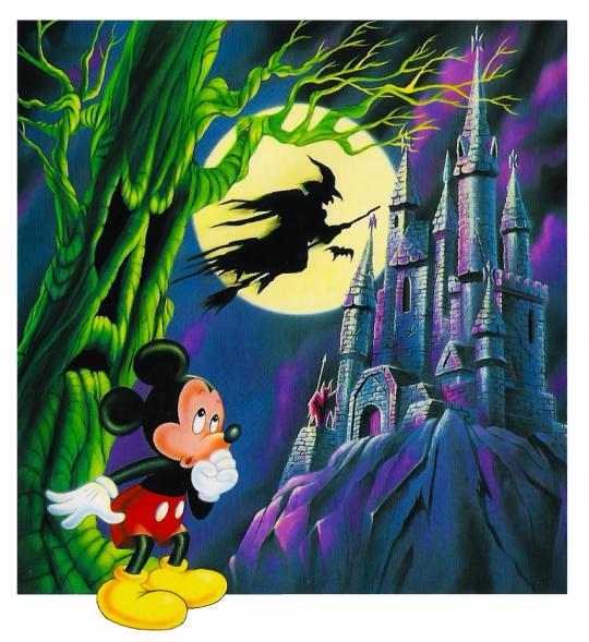
Conversely, you have the key art used for the box and marketing (provided by Ryan McGinley of Video Game Art Archive). It’s a strange contrast and the designs here don’t match the in-game visuals, particularly with the modern Mickey design superimposed over the rest of it and a witch straight out of a Halloween store cutout. It’s a kind of disparity common in video game marketing of the 80s and 90s. Still, it sells a sense of mystery, some danger, and certainly a scary mood that would have prompted me to pick up the box and read more about it on the back cover. I only miss the high point of view of the in-game scene that lent a greater sense of place to the game.
Castle of Illusion was remade and released for modern platforms back in 2013, which meant a new visual approach and a chance to reintroduce the iconic key art for a new generation.
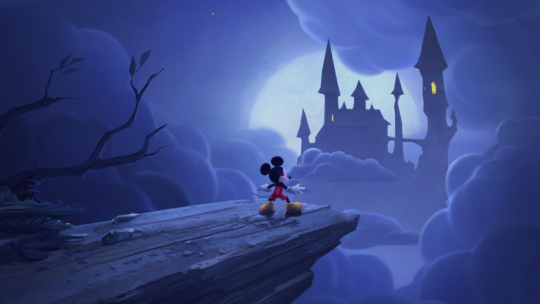
They chose the spooky aesthetic for this one and I still prefer the lighter scene from the first game, but at least they included the iconic view of the castle from the edge of a precipice.

The game’s key art is similar to the key art from the first game, with Mickey down below, in hindsight probably meant to trace Mickey’s progression from the distant cliff to the castle interior, where all the action actually takes place. It’s worth noting that the game’s final confrontation takes place in that tower at the edge of the castle and is certainly represented more consistently in the new art.
I sometimes dream of marching toward a tower atop a mountain. I never reach it, and I suspect my fascination with interactive experiences is that they allow me to actually reach the beacon and discover what it is I’m meant to see. They provide neat conclusions to fraught journeys that end just as they should.